The Pitfalls of Color Management from Sketch to Page
The Importance of the Initial Palette
Choosing a consistent palette from the start of the project is essential for maintaining the visual impact of your comic. This palette should adapt to the mood and genre of the work, while also anticipating rendering variations across different publication media.
The Impact of Lighting and Shadows
Lighting directly influences color perception and determines the atmosphere of each panel. Use shadows to add volume and depth, while avoiding overly dark shadows that crush colors and hinder readability.
Managing Contrast and Saturation
Finding the right balance allows colors to stand out without being garish. Saturation directly affects visual impact, while contrast should be adjusted for the readability of dialogue and graphic elements for a smooth reading experience.
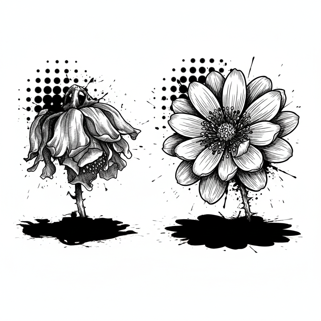
🎨 Optimize Your Colors
Transform your sketches into vibrant pages. Discover how Bulle.ai simplifies color management and exporting your artwork.
Explore Bulle.aiCommon Mistakes That Weaken Your Colors
The transition from concept to final realization is fraught with challenges. Identifying these mistakes is the first step to correcting them and bringing your pages back to life.
| Error Criterion | Detail and Impact |
|---|---|
| Unoptimized Palette | Using colors that are too bright or too dull for the final medium, leading to a loss of readability or a tiring rendering. |
| Lack of Chromatic Consistency | Discordant colors between pages or characters, harming immersion and understanding of the universe. |
| Simplistic Lighting and Shading | Absence of light source management, creating flat color areas without relief, making the image appear flat and lifeless. |
| Excessive or Insufficient Saturation | Overly saturated colors can be jarring to the eye, while undersaturated colors give a faded, lifeless appearance. |
| Poor Color Mode Management | Working in RGB for print without adequate conversion to CMYK, resulting in dull or altered colors upon printing. |
| Neglecting Textures and Gradients | Uniform color blocks without subtle variations, lacking depth and visual interest. |
💡 Captivating Colors
Don't let your colors lose their impact. Learn techniques for a professional and striking rendering of your comic or manga.
Discover FeaturesSolutions and Best Practices for Impactful Colors
To prevent your colors from losing their brilliance, adopt these proven methods that will transform your pages.
- Dynamic Palette
- Define an evolving palette that adapts to the needs of each scene while maintaining overall harmony.
- Light Management
- Use light not only to illuminate but also to sculpt forms and enhance the emotional impact of colors.
- Contrast and Readability
- Finely adjust the contrasts between elements to ensure clear reading of panels and dialogue, even with bold colors.
- Visual Consistency
- Maintain stylistic and chromatic unity throughout the work for an immersive and professional experience.
- Rendering Tests
- Perform print or rendering simulations on different screens to anticipate and correct color shifts before publication.
- AI Tool Utilization
- Leverage image generation and iteration features to quickly explore different palettes and color effects, and optimize the final rendering.
🚀 Accelerate Your Creation
Go from idea to published work faster. Bulle.ai supports you at every step, from image generation to formatting.
Try for FreeConclusion
The loss of color impact between draft and publication is a common but surmountable challenge. By understanding the mechanisms that govern color perception and applying best practices, you can ensure your work retains its full vibrancy and energy. Remember that every detail counts to captivate your reader. Experiment, test, and refine your approach for pages that leave a lasting impression. To delve deeper into creating your comic, discover how Bulle.ai can optimize your workflow.